Simplifying Colombia Aprende for inclusion and equity
Transform a long-running national education platform into a clearer and more equitable experience.
User research, information architecture, prototyping, testing, and cross-functional product direction.
81,000 resources, 70+ microsites, multiple audiences, and strong internal resistance to change.
Higher conversion, better content discovery, and more room to keep iterating with stakeholder buy-in.
Role
User Research, Information Architecture, Prototyping, Testing, Project Management
Date
March 2020 - ongoing
Team
Camilo Beltrán - development lead
Catalina Mendoza - visual and interaction designer
Natalia Torres - visual designer
Link
Sector
Education
Challenge
How do you transform a 17-year-old national platform with millions of users to improve discovery, retention, and conversion?
Background
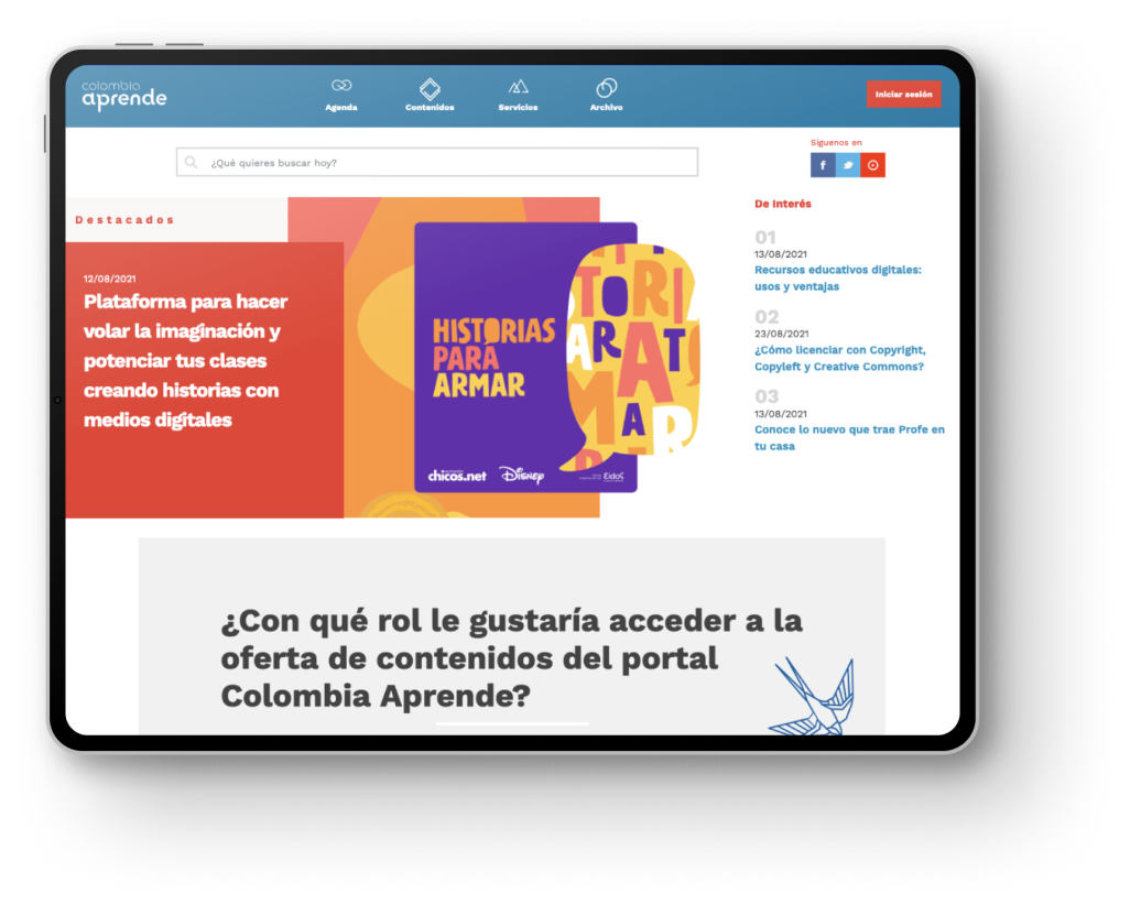
Colombia Aprende was a website too big and too complex. It was a platform that looked dated and performed poorly.
With 81,000 educational resources, more than 70 microsites, five sections, and five sub-sites for every audience of the educational community of Colombia (teachers, students, family, directives, and researchers), the whole experience was messy and lacked intention.
Before I joined, Colombia Aprende's team didn't have a connection with their users. The portal was full of meaningful resources, but the process of finding and using them was convoluted.
Process
At first, the stakeholders weren't keen on redesigning Colombia Aprende, so we began with a heuristic evaluation of the old platform to audit its usability problems.
After gathering feedback from 20 teachers and school administrators from around the country, we validated our findings with an external panel of experts at Universidad EAFIT.
Insights
Many of the most prominent spaces in Colombia Aprende were unused and outdated. Genuinely useful content was buried under layers of unnecessary clicks.
Most users bounced as soon as they found and downloaded the resource they needed to prepare a class, only coming back months or years later.
Only one content offering saw real use: Contenidos para Aprender, a collection of resources for teaching and building basic skills.
By this stage it was clear that we had to transform the whole experience. It wasn't just about ease of use — we needed to make Colombia Aprende useful, enjoyable, and above all, equitable.
To redesign Colombia Aprende and improve the whole user experience, we mixed the Double Diamond framework with Lean UX.

Understanding the challenge
The main barrier to transforming Colombia Aprende was internal. The Colombia Aprende team and stakeholders across the Education Ministry were reluctant to change a platform that had existed for more than 17 years.
So while we ran research interviews with our main audience — public-sector teachers — we also ran workshops, empathy maps, and value-proposition canvases with almost every area of the Ministry.
Our research, in that sense, included:
- Understanding the user goals and needs.
- Uncovering pain points of both end users and internal users.
- Mapping the goals of everyone involved with Colombia Aprende, from administrators to teachers and school leaders.
- Auditing the content and benchmarking similar platforms around the world.
Setting the road
After filtering all the data, we defined one main area of focus:
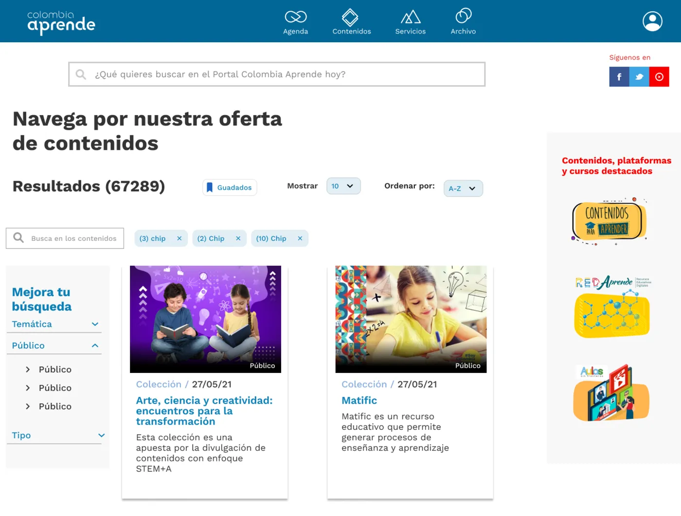
Create content collections, a new service in Colombia Aprende that became pivotal to the user journey. We defined a way to package and present multiple educational resources by topic, audience, and format.
Our goal was not only to organize our content offering. We wanted to provide users with context and guidelines to improve appropriation and discovery.
In a content collection, users don't see individual resources. It's more like a kit that the team of Colombia Aprende publishes to achieve a specific goal. It could be the promotion of certain skills, the positioning of an active learning methodology, or whatever the areas of the Education Ministry wanted to achieve with the educational community.
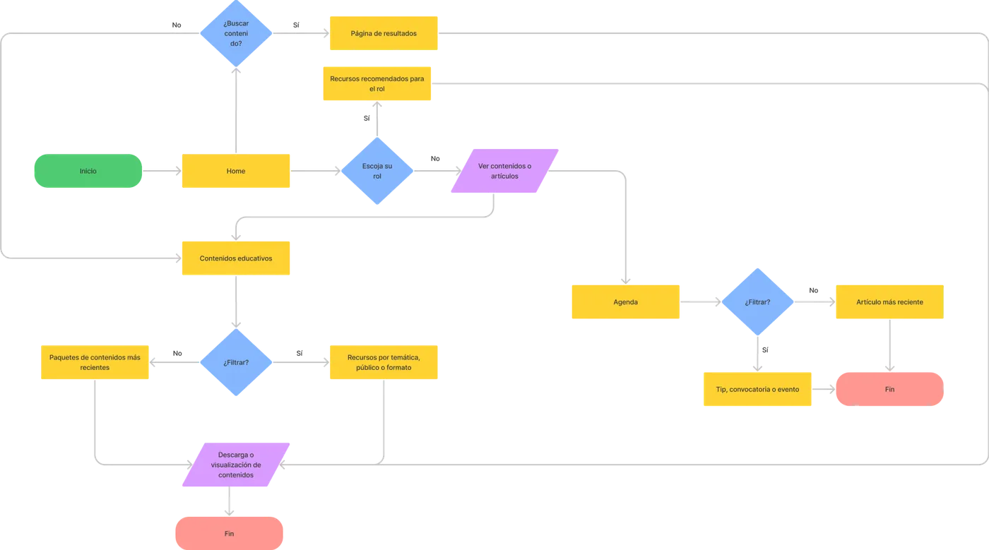
Also, by brainstorming and card-sorting, we created a new sitemap with the team, where the content section was the most important and visible through the whole navigation structure.
And lastly, we decided to approach this transformation with a socio-technical perspective to provide a clear roadmap for sustainability and scalability, two things that worried our stakeholders.
This whole package allowed us to refine the user stories, define the epics, and create the timeline of what we needed in terms of development, design, and communication.
Prototyping and testing
Once we defined the new visual identity of Colombia Aprende, we created the first mockups in Figma and published them on InVision to gather feedback and validate the user flow.
That's how we spotted flaws in our original content collections — for example, the inability to arrange and filter resources.
We built new categories with Colombia Aprende's content management staff, based on teacher feedback, and ran A/B testing to decide which of these options made it into the final interface.
Results and lessons learned
Since the new Colombia Aprende launched in October 2020, conversion has risen and content has become far easier to discover. Content collections also helped surface resources beyond Contenidos para Aprender — the one offering people used before.
Just as important, agile delivery and a user-centered process let us keep iterating and refining the experience afterwards, without renewed resistance from stakeholders.
Some of the lessons learned in this project were:
- Users come from everywhere: It wasn't just about our end users. To achieve lasting transformation, we had to include Colombia Aprende's staff and key stakeholders from different areas of the Ministry.
- It all begins with a vision: It's fundamental to gather insights and analyzing data for both improving user journeys and creating a common vision, an inspiring goal.
- Keep it simple: It may sound cliche, but when you're dealing with a website as large and old as Colombia Aprende, you have to give yourself permission to make it a little bit smaller, to narrow the focus.